Monday 6 January 2014

Evaluation - Question 4


How did you use media technologies in the construction, research, planning and evaluation stages?

Camera - I was fairly familiar when using the video cameras as I had been using them to make other products, both print and film in my previous few years of studying media, so I was comfortable with using the settings and various options, including the various modes and still image options. 
What I did struggle with was when I had to record sound as it appeared to be low quality with fuzzy feedback and I needed crisp, high quality to produce professional results, I eventually had to resort to using the sound recorder on my I Phone. 
The zoom also posed problems for me as the camera had a hard time focusing when the camera was at full zoom, I then decided I wouldn't use any slow zoom shots and that I would use panning shots instead.

Tripod - I had used the tripod on various occasions when taking still images to keep the pictures level and at the same height but had never used a tripod when filming so was unfamiliar with the options for allowing the camera to pan horizontally and vertically and to tilt on a slanted angle, this posed problems when trying to pan smoothly but improved with practice.

Light Box - Using the light box was a massive help when filming in dark areas as it gave a soft light that allowed the scene to still look like it had been shot in the dark.

Photoshop - Photoshop has always been the editing program I've used when doing print work so I was perfectly comfortable when using it to create my film poster and magazine front cover. I have done plenty of exploring on Photoshop due to its vast amount of options and editing techniques so I am always learning and finding new things to try out.
When making the film poster, the focus of my experimentation was the hue of the characters faces. I had originally planned for the characters to be in black and white but they looked too dull and seemed to blend in with the background, I then decided that it would look better if the characters matched the base colour of the secondary picture, the yard, which was a copper-like colour. I changed the hue of the pictures from black and white to get the copper colour and then changed the brightness and contrast to add more shade and highlights to the character's faces so they would appear sharper and more crisp. 
I struggled a little to get the two characters to match in hue and contrast as I had taken the pictures separately and at different times of the day so their original shadows differed, resulting in the same amount of colour and shading to cause a different effect.
I also experimented with the brightness and contrast when making the magazine front cover so the that the flash of the camera didn't make the subjects face too shiny and, with the use of shading, made the subject's features more prominent.   

Pinnacle - I had only used pinnacle once before making this product so experimented massively with the options throughout the production of the trailer.
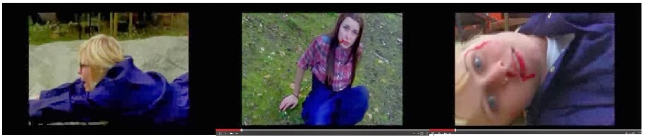
I managed to change the lighting in various scenes to make it appear darker and more relevant to it's genre and seemed to take away the glare when the sun had been shining in some scenes.
I struggled a little at first with cutting the clips down to the right time, making the transitions the same length and having it tie in with the pace of the music, this seemed to improve after multiple attempts and practice. 
 
Blog - This was the first time I had used a blog to document my work so the whole concept was pretty new to me, though it only posed problems for a few days while I figured out how it worked and which button did what. It then became a sort of asset to me as I was recording my work as I went, this decreased the chances of me losing any paper work and allowed me to be completley detailed in my documentation.

Evaluation - Question 3


What have you learned from your audience feedback?

When I first revealed my product it was to just to my classmates and teacher as we had decided to share out pieces so we could give critical and honest comments to help us improve our work if necessary.

The strongest comment I received was that my storyline wasn't very clear as the audience was confused as to why the characters were at that specific location in the first place and why young women were working there. To remedy this I decided to use text between transitions to explain a little more about the content of the trailer and to give the audience a clear depiction of what it entailed. The first question I conducted in my questionnaire was whether the audiences fully understood the content within the trailer and whether the could explain what the trailer was about. Almost everyone asked understood the trailer and knew that the characters were community workers.

Through the audience feedback I received through the other answers in the questionnaire I learned that, though everyone agreed that they would watch the full length feature after seeing the trailer, but a lot of people disagreed with the choice in film classification and said that the content was too disturbing to be a 15 as there were scenes that involved dead bodies, a large majority of the audience suggested that it should possibly be given the higher age classification of 18.

Other than that, the feedback I received was mostly positive, with a vast majority of the audience agreeing with the choices I made when making this product.

Sunday 5 January 2014

Evaluation - Question 2


How effective is the combination of your main product and ancillary texts?

To answer this question I conducted a questionnaire, consisting of 10 questions, which I handed out to a group of people varying in age and gender, below are a some examples of filled in questionnaires:-


After reading all the questionnaires I then converted the answers into pie charts:-

Question 1


The majority of the people I questioned fully understood the storyline and correctly explained what it entailed, the people who answered 'No' were confused as to what the antagonist was, whether it was supernatural, alien, or human.

Question 2


 Almost every person I asked said that they would watch the full length feature due to their curiosity as to who or what was killing the characters and wanting to know whether anyone survived, the people who answered 'no' stated that they simply didn't like the horror genre.

Question 3


More than half of the people I asked said that they believed the trailer was aimed at them due to the characters being the same age and gender and the fact they liked the horror genre, others disagreed, saying that it was either because there were no male actors or actors of their own age.

Question 4


Everyone I asked agreed that the trailer was appropriate to its genre, saying that the scenes within the trailer were scary and disturbing enough to conform to the horror genre.

Question 5


Less than half the people I asked agreed with the age classification, with some saying that even people at the age of 12 would be able to handle the content, these people were mainly under the age of 16. The majority of the people I asked disagreed with the classification, saying that the content was to disturbing.

Question 6


Half of the people I asked related to the content, saying that the characters were around the same age and gender, the other half said no, due to the fact that they had never been on community service.

Question 7


Every person I asked said that they had seen similar trailers with most people stating films like 'The Woman in Black' and 'Insidious'.
Question 8

When asked if they could state any differences, the majority of people noted that the trailer had been filmed in daylight and that there was no spoken narrative. 

Question 9


Almost every person agreed with the choice of music, saying that it worked well with the trailer and that it was sufficiently disturbing and scary, the people who disagreed said it was because the music was a little repetitive.

Question 10

When asked if anything was lacking in the trailer, almost every person said that I could have added some spoken narrative.

Ancillary Texts:
  • When asked about how effective the ancillary texts were. the majority of people asked stated that they would be enticed into watching the main product due to the professional look of both pieces and the fact that, though there were only female models, there had been a clear attempt to keep the ancillary texts gender neutral because of the blue and black based colour schemes. When asked if there was anything that could have been added or improved to either of the texts , most people said that the top of the film poster looked a little incomplete due to the lack of text and that the text on the film magazine front cover could have been clearer, possibly with a contrasting colour scheme.

Overall, I believe that the the combination of my main product and ancillary texts was quite effective, with the questionnaire producing mostly positive feedback.

Thursday 19 December 2013

Evaluation - Question 1


In what ways does your media product use, develop or challenge forms and conventions of real media products?


For the most part I tried to stick with conforming to the codes and conventions that a horror trailer possesses, for everything from technical attributes to storyline and even locations and props.
For the technical aspect of the trailer I tried to use camera angles, editing and use of equipment to conform to the structure and aesthetics that a horror trailer provides;


Editing

  •  Fades to Black – Using this helps suggest a shift in time and is a commonly used transition in almost every genre of film. The slow style of the transition and placing text between them helps set the pace of my trailer overall.


  • Changing the Lighting – Though I filmed my trailer in the daylight, I edited the lighting using pinnacle to increase the contrast and make the overall shot look darker. This gave the trailer more relevance to its genre and made the fake blood I had used on the actors look more authentic and took away some of the shine that fake blood seems to have.


  • Quick Cut Shots – This is a typical technical technique used in horror trailers to emphasise the climatic scenes within the film itself, this is usually shot during Todarov’s idea of the attempt to restore a new sense of equilibrium, more commonly known as the attempt to get rid of the problem and is edited in quick cut transitions to increase the heart rate and build to the peak of the trailer.


  • Long Climactic Shot – Almost every trailer, no matter the genre, has a long climactic scene, this is the part in the trailer where you tend to entice the majority of your audience into watching the full length feature and increase the tension of the overall trailer. This shot normally lasts at least a few seconds longer than the shots that keep pace with the music and, usually, only contains diegetic sound or an audible heartbeat. I placed this shot just before the title screen, giving it more chance of being remembered.


  • Lower Case Text – This technique is also used in most film trailers as audiences tend to read lower case text faster that upper case text. I also put lower case text in my trailer as putting it in capitals seemed to make the text look like it was shouting and that gave the wrong feel to the subgenre I was going for as it needed to have more of I detached feel instead of an ‘in your face’ horror trailer.


  • Music – Music is extremely important in a film trailer as it helps the trailer keep a consistent pace and helps the audience associate with the genre. I used a moderately steady pace of music for the introductory parts of the trailer and then used a quicker beat for the quick cut shots. This created a guideline for how quick the shots should be and allowed them to last the same amount of time, helping to make my trailer look consistent.

  • Titles - Mentioning other films is, more often than not, an important convention of film trailers. Stating other films that have already been viewed by large numbers of the audience is a great promotional method as it almost reassures the audience that it has as much entertainment value as a film that has already proved itself.


 Camera
  • Hand Held Shots - Hand held shots are used regularly in films and trailers and are vital to genres like Horror. When it came to shooting the quick cut shots that built up to the climax, the camera was hand held, for some scenes this was purely for the fact that getting a close up shot at ground level was extremely difficult when using a tripod so a hand held shot was needed. Others, such as the scene with the character attempting to flee, allowed the shot to look more frantic, increasing the fear within the audience, and emphasised that the audience was seeing things from the antagonist's point of view and helped them be more aware of the fear in the characters eyes.
  • Panning - Panning is a great way to create movement within a scene, stopping it from looking like a boring still image rather than a motion picture. It also allows the audience to see more of a location and feel like they are watching the characters move through there own eyes rather than looking through a screen as it is unnatural for someone to keep their head still while watching things go on around them, it helps indulge the audience in their curiosity.
  • High Angle Shots - This shot is extremely common within the horror genre especially when used for the victim. Using this angle allows the victim to appear small and vulnerable, instantly gaining sympathy for the audience and a want for them to live. When using this in the scene where the audience is seeing from the antagonist's point of view it, in turn, allows them to look bigger and, as a result, more intimidating scary.

  • Close Ups - Close ups are constantly used in films and their trailers, whether it be a Romantic comedy, Sci-fi, Adventure/Thriller or Horror, yet seems to give a different effect relative to it's genre. When using this shot in the film trailer it allowed the audience to see the fear within the characters, causing them to become more scared and, during the fast cut shots, created shock due to the subject within the shot being so close, this is effective when it is a close up of a person as people tend to find someone invading their personal space to be quite uncomfortable.
Dracula


Use Of Equipment
  • Tripod - Using the tripod was extremely helpful, especially within the introductory shots, as it allowed my trailer to appear more professional and kept the pace of the shots smooth and steady helping it to stay in time with the music and making the editing process a lot easier.
  • Light box - The use of a light box was extremely helpful when it came to filming the climactic scene as it was done within a dark room. Turning the regular ceiling light on or using the light from outside would have created too harsh a lighting that would have been impossible to edit without losing the detail within the shot so using a light box gave a soft light that allowed the scene to look like it had been filmed in the dark without losing the detail within the location, the make up used for the hand and the character's expression.

For the narrative part of the trailer and the subject of the storyline itself, the use of things such as props, make-up and the location helped me to conform to the codes and conventions of real horror trailers. 

Props
  • Props are used in anything and everything and are extremely important when used in a trailer, whatever the genre, with different props creating different effects and reactions from the audience. The use of shovels, clothing and background props such as wood, metal and broken equipment throughout helped depict a clear storyline and allowed the characters to blend in with the overall narrative and allowed them to remain constantly relevant to the genre.
Make-up
  • The same can be said when it comes to make up as using things such as fake blood, fake nails, kohl based materials and matte eye shadows to create bruises and dirt helped the trailer look more professional as a whole. 
Location
  • When it came to the location, the place had to be changed quite early on in the planning of the trailer, it had originally been planned to be at an unused chapel in Garthorpe but had to changed due to it being bought and in the middle of it being renovated into a home. Filming in this location would have been difficult for the actors to get to regularly in the first place due to the costs of transport and having risk of injury being added to the problems caused a change in location to be necessary. The location was then changed to a yard in Swinefleet, this location was easier to get to and from and, while it still posed a slight risk of anyone getting injured, it was a lot safer than the previous location.

  • Though having to change the filming location was an inconvenience, making the change so early on in the planning rather than later was fortunate as a storyboard hadn't been made yet so only a minimal amount of paper and notes had to be scrapped.

While I managed to conform to the codes and conventions of a horror trailer for the most part, there were still some aspects of the main product where I had failed to do so or felt it was unnecessary to add and decided to challenge.


Filming in the daylight
  • The usual convention of the horror genre is that, for the most part, it is filmed in the dark, creating an atmosphere that emphasises the unknown and pushes the idea that the majority of people are afraid of the dark. There are various reasons due to the trailer being filmed in daylight due to the actors only being available throughout the day because of the actors living in Goole, only being available on the weekends during the day and there being no buses travelling on a night during the weekends. There was also the safety risk as the location would have become a lot more dangerous to walk around due to most of the area lacking any lights.
The Lack of a Voice Over
  • Most trailers, horror included, tend to have a spoken narrative either to help with the suspense/atmosphere or to create a clearer storyline. The trailer lacks a voice over as I felt it helped to create a detached feeling that related to its title 'Nowhere To Go' and emphasised the feeling of loneliness, vulnerability and isolation.

Overall I believe, that through the use of both technical and creative aspects, my main product used, developed and challenged the codes and convention of real horror trailers.


Main Product


Ancillary Text - Film Poster


Ancillary Text - Front Cover