Thursday 19 December 2013

Evaluation - Question 1


In what ways does your media product use, develop or challenge forms and conventions of real media products?


For the most part I tried to stick with conforming to the codes and conventions that a horror trailer possesses, for everything from technical attributes to storyline and even locations and props.
For the technical aspect of the trailer I tried to use camera angles, editing and use of equipment to conform to the structure and aesthetics that a horror trailer provides;


Editing

  •  Fades to Black – Using this helps suggest a shift in time and is a commonly used transition in almost every genre of film. The slow style of the transition and placing text between them helps set the pace of my trailer overall.


  • Changing the Lighting – Though I filmed my trailer in the daylight, I edited the lighting using pinnacle to increase the contrast and make the overall shot look darker. This gave the trailer more relevance to its genre and made the fake blood I had used on the actors look more authentic and took away some of the shine that fake blood seems to have.


  • Quick Cut Shots – This is a typical technical technique used in horror trailers to emphasise the climatic scenes within the film itself, this is usually shot during Todarov’s idea of the attempt to restore a new sense of equilibrium, more commonly known as the attempt to get rid of the problem and is edited in quick cut transitions to increase the heart rate and build to the peak of the trailer.


  • Long Climactic Shot – Almost every trailer, no matter the genre, has a long climactic scene, this is the part in the trailer where you tend to entice the majority of your audience into watching the full length feature and increase the tension of the overall trailer. This shot normally lasts at least a few seconds longer than the shots that keep pace with the music and, usually, only contains diegetic sound or an audible heartbeat. I placed this shot just before the title screen, giving it more chance of being remembered.


  • Lower Case Text – This technique is also used in most film trailers as audiences tend to read lower case text faster that upper case text. I also put lower case text in my trailer as putting it in capitals seemed to make the text look like it was shouting and that gave the wrong feel to the subgenre I was going for as it needed to have more of I detached feel instead of an ‘in your face’ horror trailer.


  • Music – Music is extremely important in a film trailer as it helps the trailer keep a consistent pace and helps the audience associate with the genre. I used a moderately steady pace of music for the introductory parts of the trailer and then used a quicker beat for the quick cut shots. This created a guideline for how quick the shots should be and allowed them to last the same amount of time, helping to make my trailer look consistent.

  • Titles - Mentioning other films is, more often than not, an important convention of film trailers. Stating other films that have already been viewed by large numbers of the audience is a great promotional method as it almost reassures the audience that it has as much entertainment value as a film that has already proved itself.


 Camera
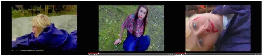
  • Hand Held Shots - Hand held shots are used regularly in films and trailers and are vital to genres like Horror. When it came to shooting the quick cut shots that built up to the climax, the camera was hand held, for some scenes this was purely for the fact that getting a close up shot at ground level was extremely difficult when using a tripod so a hand held shot was needed. Others, such as the scene with the character attempting to flee, allowed the shot to look more frantic, increasing the fear within the audience, and emphasised that the audience was seeing things from the antagonist's point of view and helped them be more aware of the fear in the characters eyes.
  • Panning - Panning is a great way to create movement within a scene, stopping it from looking like a boring still image rather than a motion picture. It also allows the audience to see more of a location and feel like they are watching the characters move through there own eyes rather than looking through a screen as it is unnatural for someone to keep their head still while watching things go on around them, it helps indulge the audience in their curiosity.
  • High Angle Shots - This shot is extremely common within the horror genre especially when used for the victim. Using this angle allows the victim to appear small and vulnerable, instantly gaining sympathy for the audience and a want for them to live. When using this in the scene where the audience is seeing from the antagonist's point of view it, in turn, allows them to look bigger and, as a result, more intimidating scary.

  • Close Ups - Close ups are constantly used in films and their trailers, whether it be a Romantic comedy, Sci-fi, Adventure/Thriller or Horror, yet seems to give a different effect relative to it's genre. When using this shot in the film trailer it allowed the audience to see the fear within the characters, causing them to become more scared and, during the fast cut shots, created shock due to the subject within the shot being so close, this is effective when it is a close up of a person as people tend to find someone invading their personal space to be quite uncomfortable.
Dracula


Use Of Equipment
  • Tripod - Using the tripod was extremely helpful, especially within the introductory shots, as it allowed my trailer to appear more professional and kept the pace of the shots smooth and steady helping it to stay in time with the music and making the editing process a lot easier.
  • Light box - The use of a light box was extremely helpful when it came to filming the climactic scene as it was done within a dark room. Turning the regular ceiling light on or using the light from outside would have created too harsh a lighting that would have been impossible to edit without losing the detail within the shot so using a light box gave a soft light that allowed the scene to look like it had been filmed in the dark without losing the detail within the location, the make up used for the hand and the character's expression.

For the narrative part of the trailer and the subject of the storyline itself, the use of things such as props, make-up and the location helped me to conform to the codes and conventions of real horror trailers. 

Props
  • Props are used in anything and everything and are extremely important when used in a trailer, whatever the genre, with different props creating different effects and reactions from the audience. The use of shovels, clothing and background props such as wood, metal and broken equipment throughout helped depict a clear storyline and allowed the characters to blend in with the overall narrative and allowed them to remain constantly relevant to the genre.
Make-up
  • The same can be said when it comes to make up as using things such as fake blood, fake nails, kohl based materials and matte eye shadows to create bruises and dirt helped the trailer look more professional as a whole. 
Location
  • When it came to the location, the place had to be changed quite early on in the planning of the trailer, it had originally been planned to be at an unused chapel in Garthorpe but had to changed due to it being bought and in the middle of it being renovated into a home. Filming in this location would have been difficult for the actors to get to regularly in the first place due to the costs of transport and having risk of injury being added to the problems caused a change in location to be necessary. The location was then changed to a yard in Swinefleet, this location was easier to get to and from and, while it still posed a slight risk of anyone getting injured, it was a lot safer than the previous location.

  • Though having to change the filming location was an inconvenience, making the change so early on in the planning rather than later was fortunate as a storyboard hadn't been made yet so only a minimal amount of paper and notes had to be scrapped.

While I managed to conform to the codes and conventions of a horror trailer for the most part, there were still some aspects of the main product where I had failed to do so or felt it was unnecessary to add and decided to challenge.


Filming in the daylight
  • The usual convention of the horror genre is that, for the most part, it is filmed in the dark, creating an atmosphere that emphasises the unknown and pushes the idea that the majority of people are afraid of the dark. There are various reasons due to the trailer being filmed in daylight due to the actors only being available throughout the day because of the actors living in Goole, only being available on the weekends during the day and there being no buses travelling on a night during the weekends. There was also the safety risk as the location would have become a lot more dangerous to walk around due to most of the area lacking any lights.
The Lack of a Voice Over
  • Most trailers, horror included, tend to have a spoken narrative either to help with the suspense/atmosphere or to create a clearer storyline. The trailer lacks a voice over as I felt it helped to create a detached feeling that related to its title 'Nowhere To Go' and emphasised the feeling of loneliness, vulnerability and isolation.

Overall I believe, that through the use of both technical and creative aspects, my main product used, developed and challenged the codes and convention of real horror trailers.


Main Product


Ancillary Text - Film Poster


Ancillary Text - Front Cover


Thursday 28 November 2013

Planning


Possible cast -
  • Tonicha-Rose Bryars 


  • Maya Tether


  • Amy Cowling


  • Georgia Cowling


  • Kara Williams


  • Beth Burns


Possible Locations - 
  • Garthorpe Chapel


  • Swinefleet Yard


Possible Props -
  • Jumpsuits
  • Black boots
  • Shovels
  • Fake blood
  • Car
Possible Costumes -
  • Jumpsuits
  • Boots
  • Messy hair
  • No/Scruffy makeup
  • no jewellery
  • old clothes to go under jumpsuits
Climax Shot Makeup - 
  • red/brown lipstick
  • eyeshadows (bruise colours
  • cotton wool
  • fake nails
  • fake blood
Equiptment - 
  • light boxes
  • tripod
  • extension lead (if needed)
  • makeup equiptment

Storyboard - Quick cut detail


StoryBoard


Time Plan

 
26/09/13 - Location/Cast/Props.
 
03/10/13 - First few scenes completed.
 
17/10/13 - Most of practical work will be finished.
 
21/10/13 - Music decided.
 
04/11/13 - Practical work finished.
 
14/11/13 - Shots will be edited and will be placed with music
 
18/11/13 - Both the poster and the magazine will be completed.

Codes and Conventions - Film Magazine


Screen Shots / Pictures – In all cases a review page will feature a still screen shot or image taken from the film – either directly from an in-film shot, or from the front cover. Alternatively, many review pages will have some sort of cropped image defining the genre of the film, such as a lone woman victim. The purpose of using an image is varied; to identify a famous actor as a protagonist, to give an overviewing tone of the film or even just provide a teaser, essentially the purpose is to entice the audience into finding the film interesting.

Titles – Many review pages identify the title of the film as a main selling point, or as a point of generating interest. A well-followed franchise of films will make the title of the film the focus point as the reviewer wants to draw attention to the title to attract an already curious audience. Typically the title is not in bright colours or diverse fonts, the reviewer wants the page to be simple and easier to read from not just a long distance – also there is a sense of professionalism, there is no need for flashy colours to entice the audience.

Rating – The most important detail of the review page, apart from the in-depth analysis, is the rating system. In most reviews the rating system will be ranked as number out of 10, or 5, as this is the simplest convention and is easy for the audience to understand. Several others complicate the rating system to provide a greater detail for the review, such as percentages out of 100. The importance of the rating is underlined in the trust and respect the audience has for the reviewer, while a high review will attract an audience just as easily as an extremely low one.

Captions – Although not the most common convention, several magazines utilise a caption to describe the context of an image within the film, or sometimes including a pun playing upon the picture. The purpose of this can merely be interaction with the audience, but sometimes it can provide depth and context which will encourage the audience to read the review.

Short Plot Details – Within all reviews, the plot of the film is summarised without any ‘spoilers’ to give a brief overview of the film, so as to entice the audience into watching it or to provide a backlog for the audience to relate to the review later. Most of the time the plot is written as briefly as possible, giving the opening developments of the film or what has already been revealed on trailers and interviews.

Directors & Actors – In many high-budget films, a major selling point is the inclusion of famous ‘Hollywood Actors’ and Directors, who have in the past featured in popular films. Review pages will often pick up on this, depicting an image of the actors as a screen shot or including them in a headline next to the title of the film. Sometimes an image of both the actor and director will be included in the shot, which increases the interest of the audience massively.

Quotes – Sometimes review pages will feature quotes, either from the film itself or from interviews from the reviewer or generally to public outlets. Quotes can work in both ways; a quote from the film will engage the audience in an active interaction with the film before even watching it, giving them an incentive to watch it themselves. As well as this, a quote from an interview gives the audience depth and context to the reality of the actors or director, which the audience can relate to – often this leads to the audience taking a more active interest in the film and watching it.

Review – The main body of the review page is often the review itself, which consists of several ‘strands’ which create it. The in-depth analysis is just one, albeit large aspect of the review, which the majority of the time takes up a large portion of the page or a whole page in a double page spread. Often the analysis will piece together the positive and negative aspects of the film while attempting to add human feeling to it with emotions. The other aspects of the review include the rating, the main image, the captions, the colours of the page (tone – black and white often connotes a dull sense, while colours spark up an interest).

Title/ Logo of magazine – Lastly, the title of the magazine review is often depicted in high-profile magazines or exclusives. Essentially the title is the banner to attract the audience, as the reader relates the title to that of a film reviewer  – it’s a very simple technique but often examples such as ‘TotalFilm’, ‘Empire’ or ‘NewFilm’ are renowned for their reviews and many will simply choose these names before any others. The logo’s colours are mostly different and unique from others, so the audience can differentiate between them, while a few logos are bright coloured or professional to attract their target audience.


Codes and Conventions - Film Poster


Dark and dull Colour Scheme – Many film posters use a darkened colour scheme to reflect the themes of the film, for example shadows and darkness are linked with fear and terror. While a lack of colour could represent a lifeless feel to the poster, signifying death or decay, again both typical horror themes.

Red / Black Colour Scheme – While several posters use a dark colour scheme to connote fear, others use typical colours to signify the sub-genre of their horror film. An example could be an excessive use of red to signify blood and a ‘slasher’ horror.

Distorted text – Usually on film posters the title text or text in general has themes of horror, such as an eroded text to show decay. Another example could be distortion to represent the aspect of confusion or paranormal themes.

Main Image – A common aspect of film posters is the focus of the main image, this can be used for two main reasons. One of which is the eye-catching nature of the image, a large image which fills most of the poster will attract the attention of the reader – especially if the image is abnormal or unnatural.

Main Image 2 – Another feature of the main image is to reflect the focus and themes of the film, obviously the image connotes the themes of horror but often it signifies the sub-genre of the film to attract a specific audience. Typical aspects of films like a classic zombie apocalypse will include a rising hand from the earth, the rise of the dead.

An Eye-catching Title – Most posters position their titles at the bottom of the page, usually just with a few words on a single line for simplicity and easy reading. This is not always the case, but most do this to catch the readers’ attention and create a memorable title.

Taglines – While the image and the title usually attract the audiences’ attention, the taglines are used to sell it and provide context which hopefully will interest the reader into watching the film. Mostly a short simple sentence or question is used in a creepy style to entice the reader into watching.

Release Date – This piece of information is usually placed at the bottom of the page if the release date isn’t something particularly seasonal, like Halloween or Summer – which are common themes of horror films. If the release date is based at an interesting time, it will be a main focal point of the poster, with a line such as “Coming this Halloween” etc.

Institutional Information –Typically high-budget films will include a section of information providing the reader with news of those who have worked on the film, or previous works. Aspects such as the director, actors or producers could be another main selling point of a film, if their previous films are particularly impressive or have a dedicated fan base. However, mostly Horror films do not use


Sunday 17 November 2013

Poster Credits


Poster credits are the legal lines that appear in movie posters, giving credit to the cast and crew that made the film, as well as the producers, distributor and financier behind it. Poster credits are widely known also as 'billing blocks' or 'credit blocks'.

How many lines do they have?

- Poster credits have an average of four lines, usually laying at the bottom of the poster, underneath the title. For layout purposes, you can see poster credits with 6-8 lines justified left or right. Sometimes they also circulate around the edge of the poster. Poster credits play an integral part of the design.

What logos should there be?

- By convention, the logo of the distributor appears in the bottom right, the logos of the production companies begin in the bottom left.


Camera angles in a Horror Trailer


Slanted angle: This is where the camera tilts around the subject. It is often used in horror films to create tension and disorientation, it is mostly used in dramatic scenes to draw the user in and creates distortion to the scene.


Establishing shot: This is when the setting fills up the frame, it is mostly used in the beginning of a scene to emphasize the setting, for example if there is a haunted house in the film, an establishing shot would show the house at the beginning to build tension and draw the audience into the set.


 Dark Shadows


Close up/ Extreme Close up: This is when the camera closes up on the subject, it is used in horror films to make the audience feel uncomfortable as to get close to someones face is unnerving.


Point of view: This is when the camera is from someones point of view, the camera can see exactly what they see. this is mostly used in horror films to place the audience in the characters shoes, giving the shot a more realistic feel.


Textual Analysis


Film Trailer: Insidious - Mise-en-scene

The trailer consists of a typical location, a middle class house in a nice, respectable neighborhood occupied bu a family which is also inhabited by a demon. The use of beds, windows, chairs and hospital equipment are used throughout the trailer, all of which are used to create fear when the demon is present, such as doors slamming to create a 'jump' effect


The bed appears to be the key prop throughout the trailer as it aids the overall plot of the film, in order for the demon to get into the 'mortal realm' it must go through the child when they are sleeping. This creates a sense of uncertainty as beds are seen to be a place of rest, peace, safety and comfort but, when placed within the film, produces the opposite effect. Childhood props are also used such as toys and monitors. Seeing as children are perceived to be innocent and pure, it creates fear within the audience to see these props in horrific scenes.


Textual Analysis


Trailer: The Woman in Black - Camera Shots

The trailer uses a wide shot, this camera shot emphasises the fact that the location is isolated and remote. It then switches to a shallow focus shot of a cross placed in the sand, using this type of shot tells the audience where they should focus their attention and adds to the enigma of the film.


The trailer also uses an establishing shot, depicting a clear location for the narrative and and sticking to the conventions of film trailers in general. The shot also clearly depicts the genre of the film with the shot being of a derelict in dire conditions.


There is then a close up shot of the family that previously resided within the mansion, but in the contrast to a previous close up shot of the family photo, this one has the eyes cut out, clearly depicting the type of reaction wanted from the audience and adding to the rising drama of the trailer as a whole.


The trailer then reaches its climax with the shots becoming frantic through the use of quick cuts, giving the audience a tantalising taste of the climatic scenes or the 'attempt to restore equilibrium'.


The ending shot reinforces the production name and ensures that it sticks within the audiences memory.


Wednesday 13 November 2013

Codes and Conventions of a Horror Trailer


Target Audience = more often then not it is the younger generations (15 - 21) as they tend to lack a sense of mortality.

Disruption - generally comes in the form of an object in supernatural/paranormal films. This object can be small, or it can be a whole house, but it is usually cursed or possessed by an evil entity. For example, in 'The Possession' the disruption is the purchasing of a 'Dibbuk Box' whereas in 'A Haunting in Connecticut' the disruption is a cursed house.

Quick Cut Montage - this editing technique is to increase the heart rate, fear and tension of a trailer to attract the audience. This technique is usually combined with emphasised diagetic sound or a quickening pace to increase the audiences heart rate.

Cut to Black - this is used generally with a stab of sound to shock the audience.

Title and Release date - crucial information, this is generally featured at the end of the trailer after the title, tagline and institutional information with a stab of sound intended to scare the audience and leave them with a memorable image of the movie and the name of the film.

Stabs of Sound - usually with silence beforehand, a stab of sound is used to scare the audience and make a scene scarier.

Contrapuntal Sound - this technique is when a usually innocent sound such as a lullaby, is placed over a scary scene to create horror out of innocence and destroy the safety that is usually connotated with it.

Emphasis of Diagetic sound - heavy breathing, heart beat or other quiet sounds are commonly used for tis effect and it is used to emphasise the silence of a scene. For example, if a character is hiding in a closet and the antagonist is approaching, the breathing or heartbeat of the protagonist would seem louder and the footsteps of the antagonist would aswell. This is to enhance fear.

Lighting - lights may be darker or used to highlight something are used to disorientate the audience.

Angle Shots - high angle shot are to make something appear imposing or menacing. Low angle shots are used to make something appear vunerable.

Audience


  • An audience is a group of people who consume a media text.
  • A target audience is a group of people that producers place into groups such as; age, gender, ethnicity, sexuality, cultural background, social class and special interests and aim their work at them.
Audiences need to be able to relate to the text in some way, therefore texts need to be able to touch human emotion. Audiences tend to relate to events in their own lives.

The Format of Trailers


Trailers tend to follow the same pattern as a film. They have a beginning, or introduction sequence, followed by a problem and then an attempt at the solution (This ties in with Todorov's narrative theory). This shows the audience the narrative and main plot of the film, however, it has been argued that this format reveals the whole story in the trailers. Some people suggest that all the best bits are put into the trailer to make the film appealing, but the rest of the feature leaves a lot to be desired.

Most trailers have three 'acts'. It is common for them to have three separate songs, which are quite often not included in the films as trailers are made before post production has finished where, usually, the soundtracks is one of the last things to be added. This was not the case for 'E.T.' or films with quite distinctive soundtracks.

Some trailers also include sequences that are not actually in the film. This is most famously seen in the six minute trailer for Hitchcock's 'Psycho' in which the whole trailer is shot post production and even included a different actress for the main role. However, some things are in the trailers that have been cut from the original film. An example of this is in the 'Spiderman' trailer in which there is a scene of criminals near the World Trade Center, where the film was released soon after the terrorist attacks when the area was still very sensitive.


*When researching multiple horror films I have noticed that they tend to deviate from the conventional narrative as a new equilibrium is not put in place, instead there seems to be no real end to the character's fear and suffering or the indication of a possible sequel is shown, such as in 'Isidious' where the family believe they have successfully rid the demon from the child, it becomes apparent that it has possessed the father which ques the end of the film and a possible sequel.


The beginning of Film Trailers


The first promotional trailer was not for a feature film. It was actually a promotional reel for a musical, produced by Nils Granlund, which showed excerpts of the production and raised awareness of it. Granlund also created trailer for a film in 1914, which was produced for a Charlie Chaplin film. Up until the late 1950's film trailers were made by National Screen Service which was contracted by the film companies to create the trailers for upcoming films, the company lasted until the 80's.

The early trailers consisted of short clips showing the key features of the film alongside narration, a big score soundtrack and screens with text and a cast run. An example would be the trailer from Casablanca.

Codes and Conventions


Production Companies Logo


Dark Warner Bros Logo

  • The production logo symbolises to the audience the budget of the film they are about to watch and clearly depicts who created it.
  • Film logos may give an indication to the genre of the film, as they are sometimes changed to look like the chosen genre.
  • If the production company is well known and liked, or have produced other successful films, people may want to watch other films produced by the same company, so including the logo on the trailer may encourage more people to watch the film.
  • The warner bros logo is usually quite bold looking with bright, pigmented colours but they have changed the colour scheme and overall brightness of the logo to successfully relate to the genre of film to allow audiences to quickly identify and associate.


Warner Bros Logo


Certification from the British Board of Film Classification


Classification Badge for ages 12 and over


  • The British Board of Film Classification determine the minimum age allowed to watch the certain films, determined by their content. This tells the viewers of the trailer and the target audience so they know if the film is suitable for them.


Introducing the cast and crew


  • In film trailers the names of actors involved are usually included to entice potential audience members.
  • It may also include the director, this is another way to entice the audience.

Different Paces
  • It is common for a lot of film trailers to be fast paced in order to show as many clips of the film as possible in order to give an idea of the narrative. However, sometimes the trailer starts slow and gains a faster pace in order to build tension throughout and bring the trailer to a climax.
Length of Shots
  • The length of shots varies considerably, from less than a second, to a few seconds, to a larger period of time. Although a few seconds doesn't seem long, in a film trailer, each second counts. If there is a shot that is intended to build up tension, for example in a thriller, you could have a shot of someone heavily breathing, this could last longer to build up the suspense. However, you could then have a shot of less than a second showing a scary figure. The effect of the shot length being short in a thriller is that, usually, these have the potential to make you jump, especially if it is before a long shot, when the audience aren't expecting it yet. Short shots usually shows mini clips of things that may be important to the plot, whereas longer shots may be there to give more information about the story line.

Tuesday 12 November 2013

Research


Trailer Technique
  • Long shots to establish character, setting and 'The Dilemma'
  • Fades to black to suggest a shift in time
  • Transitions accompanied by booming SFX to build tension and signifigance
  • Short, quick cuts for the climactic parts of the film
  • Quiet music to establish story, menacing music to highlight villains and/or build a crecendo
  • Sudden moments of silence to leave impact, mood and pace
Statements for Trailer Dialogue
  • This season....
  • From the people who brought you....
  • Based on the unbelievable true story....
  • Based on the best selling book....
  • Celebrity names (actors/diresctors)
  • Title
  • Official websites
  • Official Dates

Research


Narrative = story/plot - the narrative is the way in which a story is toldas the manner in which it is told can change perceptives. the meaning is constructed.

Key Concepts

  • Verisimilitude - the technique of making something look real.
  • Hyper reality - where fiction and reality mix together.
  • Inter textual - the inclusion of different texts within other forms of media.
  • Pastishe - an imitation of an art form, placing it within your own form.
  • Parody - imitation of an art form  for comedic effect.
Vladamir Propp - characters

  •   The hero
  •   The villain
  •   The donor
  •   The dispatcher
  •   The false hero
  •   The helper
  •   The princess
  •   The Father


Todorov - narrative order


  1. A state of equilibrium
  2. A disruption of the ordered state by a certain event
  3. A recognition that the disruption has taken place
  4. An attempt to repair the damage
  5. A return to a new state of equilibrium


Labov's basic elements of storytelling

  1. Abstract - How does it begin? (introduction)
  2. Orientation - Who/what does it involve? When/where? (characters)
  3. Complicating Action - then what happened (events of narrative)
  4. Resolution - What finally happened? (end of narrative)
  5. Evaluation - So what? (point/reason)
  6. Coda - What does it all mean? (the relevance)